Michael E. Smith makes sculptures, installations, object collages, and videos; he sometimes also creates interactive sound installations, conceiving of the gallery space he is working in as an active partner in the dialogical process of producing an exhibition. His installations open up a space of experience that addresses itself to much more than just our sense of vision. Integrating immaterial components such as light, sound, and habitual procedures, he seeks to sharpen all our perceptual faculties.
The development of new pieces and exhibitions typically starts in the studio, where the artist begins by producing “material sketches”: loose arrangements in which he tests things to explore their potential as vehicles of meaning. He does not finalize his works until he installs them in the exhibition setting, and many take concrete form only during this phase or even owe their existence to a moment’s inspiration. His shows are distinguished by the economical use of his resources and his keen awareness of the expressive force of formal interrelations. Carefully orchestrating the placement of his works, he arranges tightly composed yet dynamic constellations involving the objects, the spaces around them, and—sometimes immaterial—interventions. The concentration on few objects in the room creates an impression of capaciousness and emptiness—a metaphor, perhaps, for the loneliness and precariousness of human existence at large—that enhances the significance of each work and becomes an integral part of the art.
Smith’s engagement with the given architecture, the space in which his art unfolds, merits particular attention. The works are traces of a sort, hinting at the presence of a singular human being in a specific place, making an exhibition a phenomenological—and unique—event. Simple modifications such as changes to the ordinary lighting conditions by dimming or eliminating illuminants engender minimal disruptions in the system of the familiar. Subtle interventions, like the removal of door handles, alter routines, paths, and functions and sensitize both visitors and employees to the situation. Now and then he will place objects in areas that are inaccessible to visitors: cracking open the confines of the exhibition space, at least in the imagination, these displays raise questions concerning the public (audience) as well as the limitations of art and its institutions.
The sculptures and object collages are usually composed of no more than a handful of elements or even stand for themselves in the manner of readymades. Smith works with found, used, discarded, and sometimes broken articles, the stuff of daily life: furniture, clothes, and electronics, which he often combines with organic matter, primarily prepared animals or animal parts, and bones, including human bones. The human body—or the void where it was or might be—generally occupies a central position in his work. Presence and absence, movement and stillness, heaviness and lightness alternate, complementing or blending into each other.
Whimsical and occasionally shocking, Smith’s assemblages strike a somber, almost tragic keynote. Then again, his works are replete with nuances that accommodate other tempers as well. Art itself is a complex language: each thing, each action, each place comes fraught with stories and meanings. The artist offers a very specific account of what he limns as the triangular relationship between human, object, and nature and acknowledges its complications and baffling aspects. Smith’s distinctive shrewd humor informs his aesthetic sensibility and formal wit, as when he combines a plastic armchair with a sea turtle’s cranial bone, pointing up the striking similarity between the two objects’ shapes. Aiming at concentration on the essential, he has devised a strategy of reduction and maximum focus.
Smith’s work sometimes prompts associations with environmental devastation and the disappearance of—human and animal—habitats. It touches on political and social experiences, ecological crises, consumption under capitalism, and the wasteful use of resources as well as violence, death, and social injustice. His art is informed by his roots in Detroit, a city that is ground zero for the decline of American industry and the country’s working class, but has also long been home to a thriving and diverse music and alternative culture scene.
For his exhibition at the Secession, which will extend from the upstairs Grafisches Kabinett to the Galerie on the first basement level, Smith is developing new works that he will produce or arrange, assemble, and install on the scene. Prior to this, our information was limited to the materials that we obtained at the artist’s request in preparation for his stay in Vienna or that he brought: among them are a large number of secondhand turbo fans of the kind used by construction crews to increase the air circulation in rooms and buildings and improve the effectiveness of drying equipment; rocks from a quarry; a human cranial bone from the mid-nineteenth century; rabbit furs; a scuffed sofa armchair; empty guitar cases; and dried pumpkins.
The viewer’s experience of Smith’s work and exhibitions is perhaps best compared to that of the spectator in Brecht’s epic theater. The dramatist did not propose to achieve catharsis through art; the objective of his plays was precisely not to prompt an experience of purification and redemption. Rather, he sought to jolt his audience awake, spurring them to think for themselves and then take action in real life.
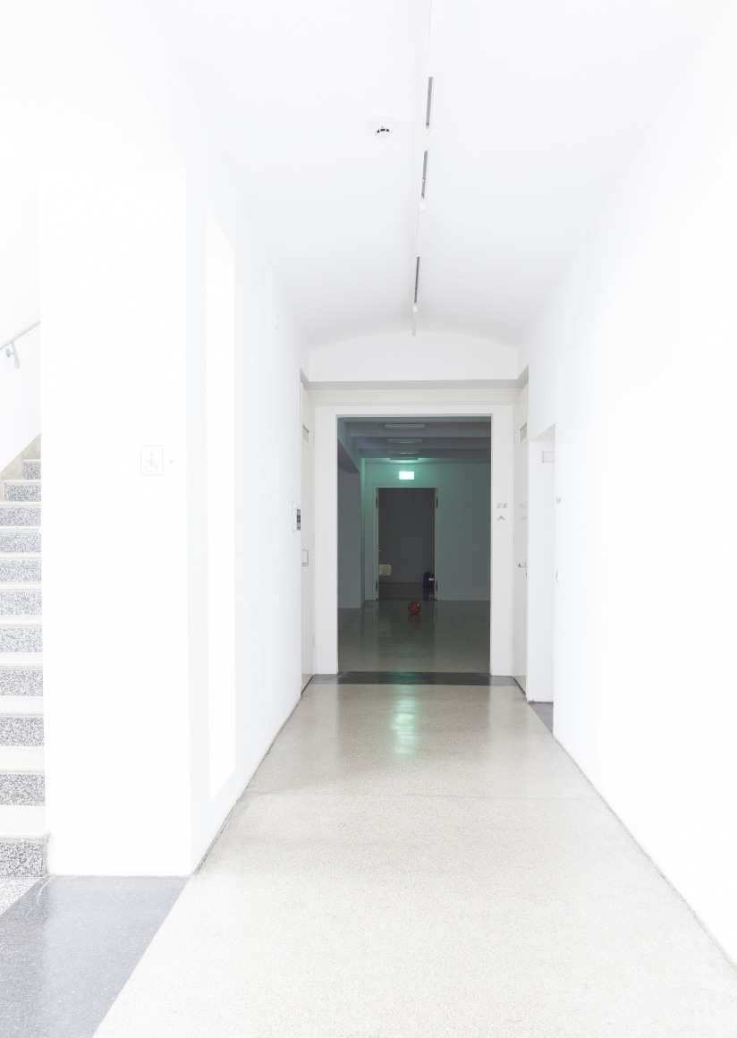
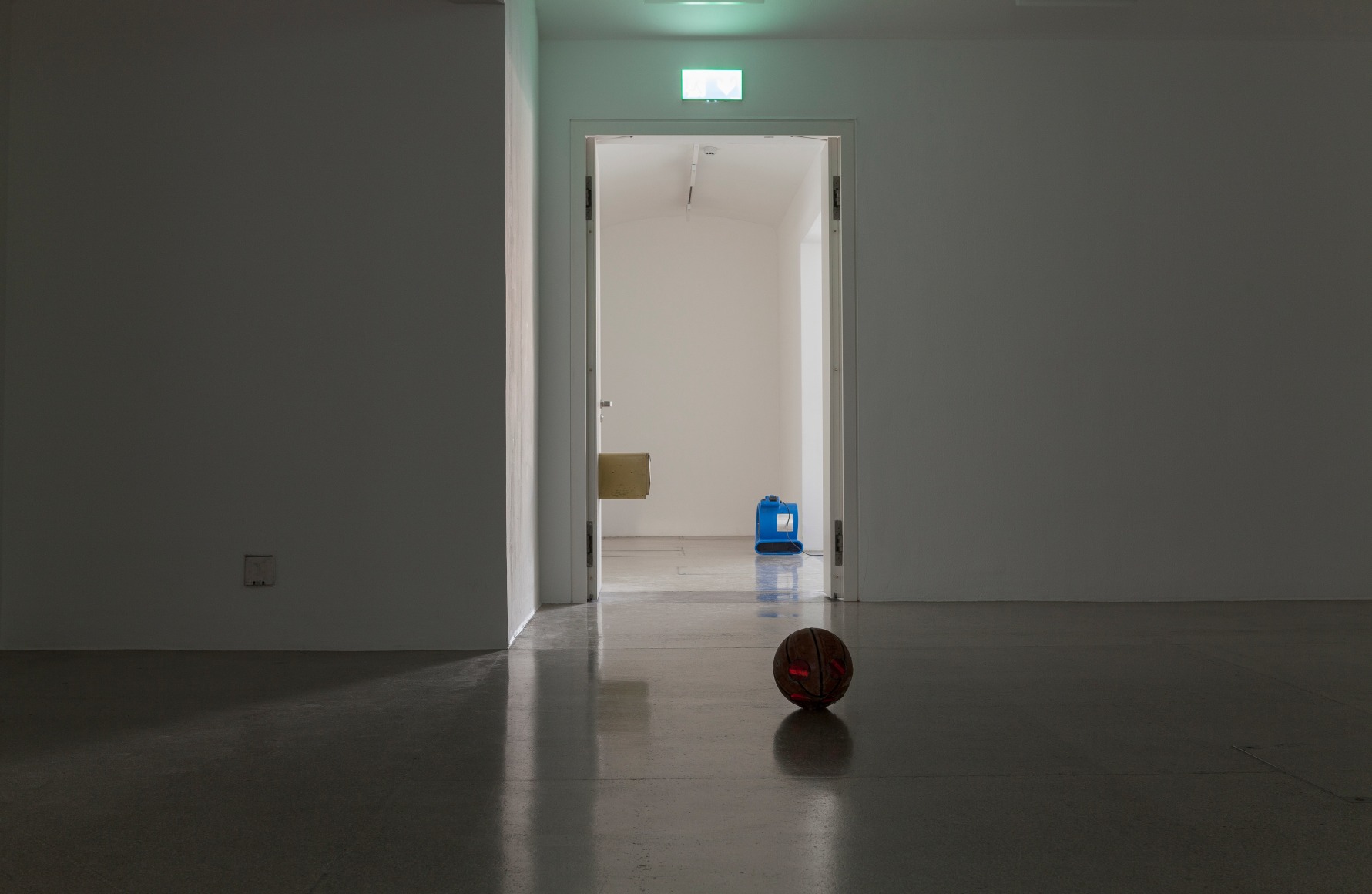
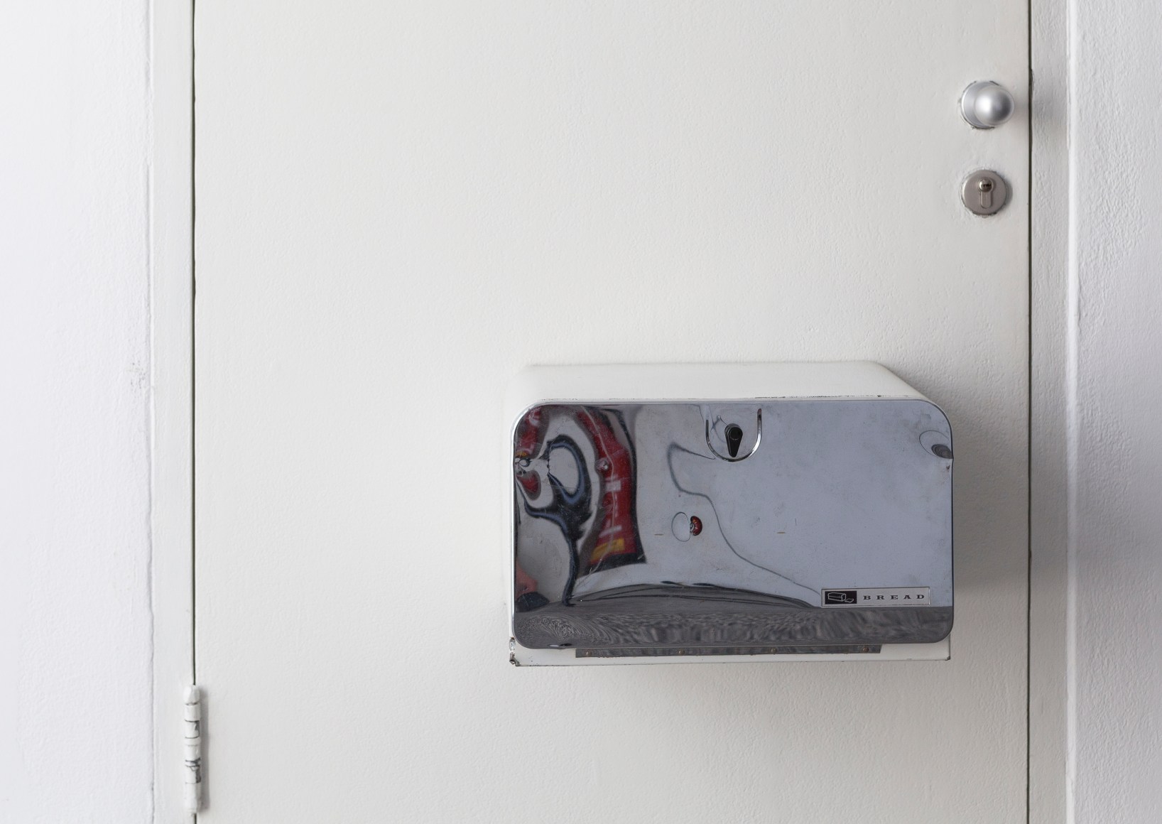
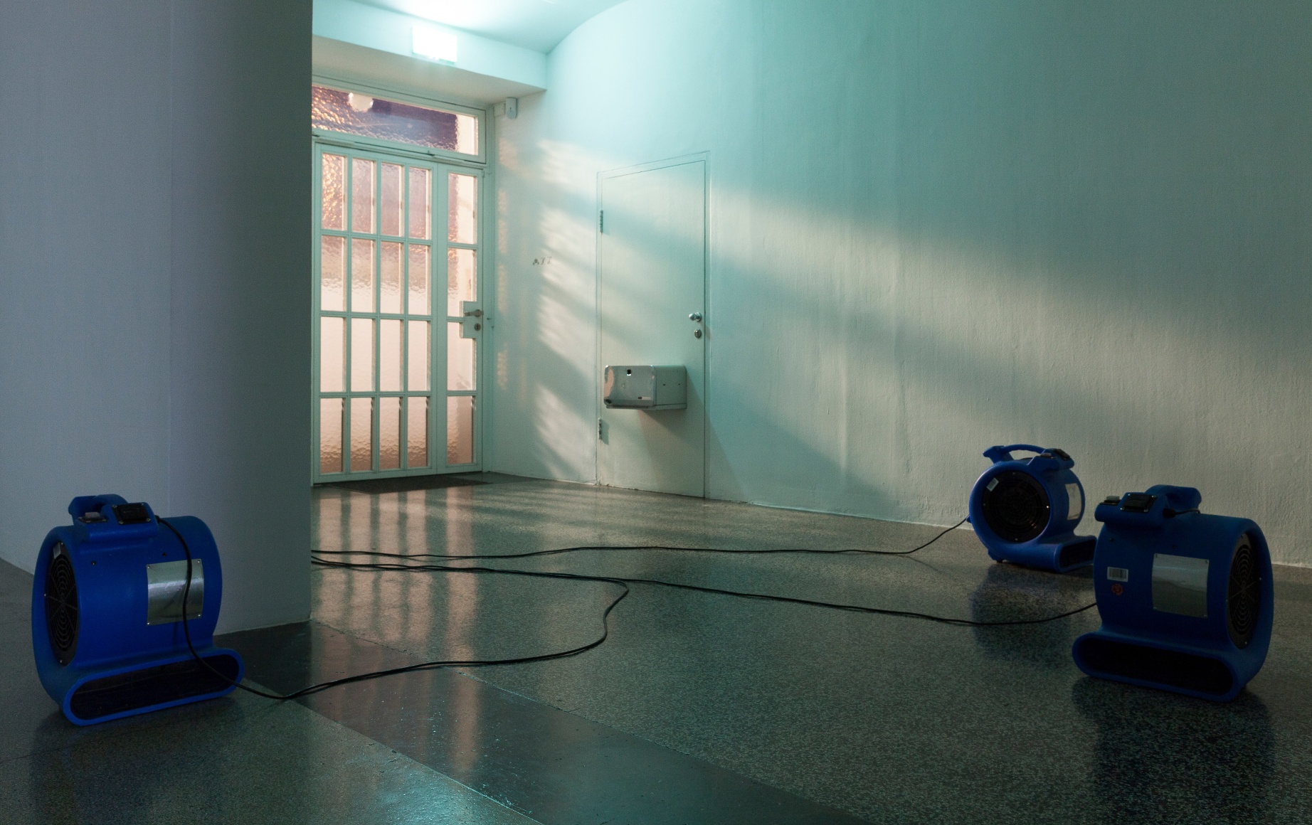
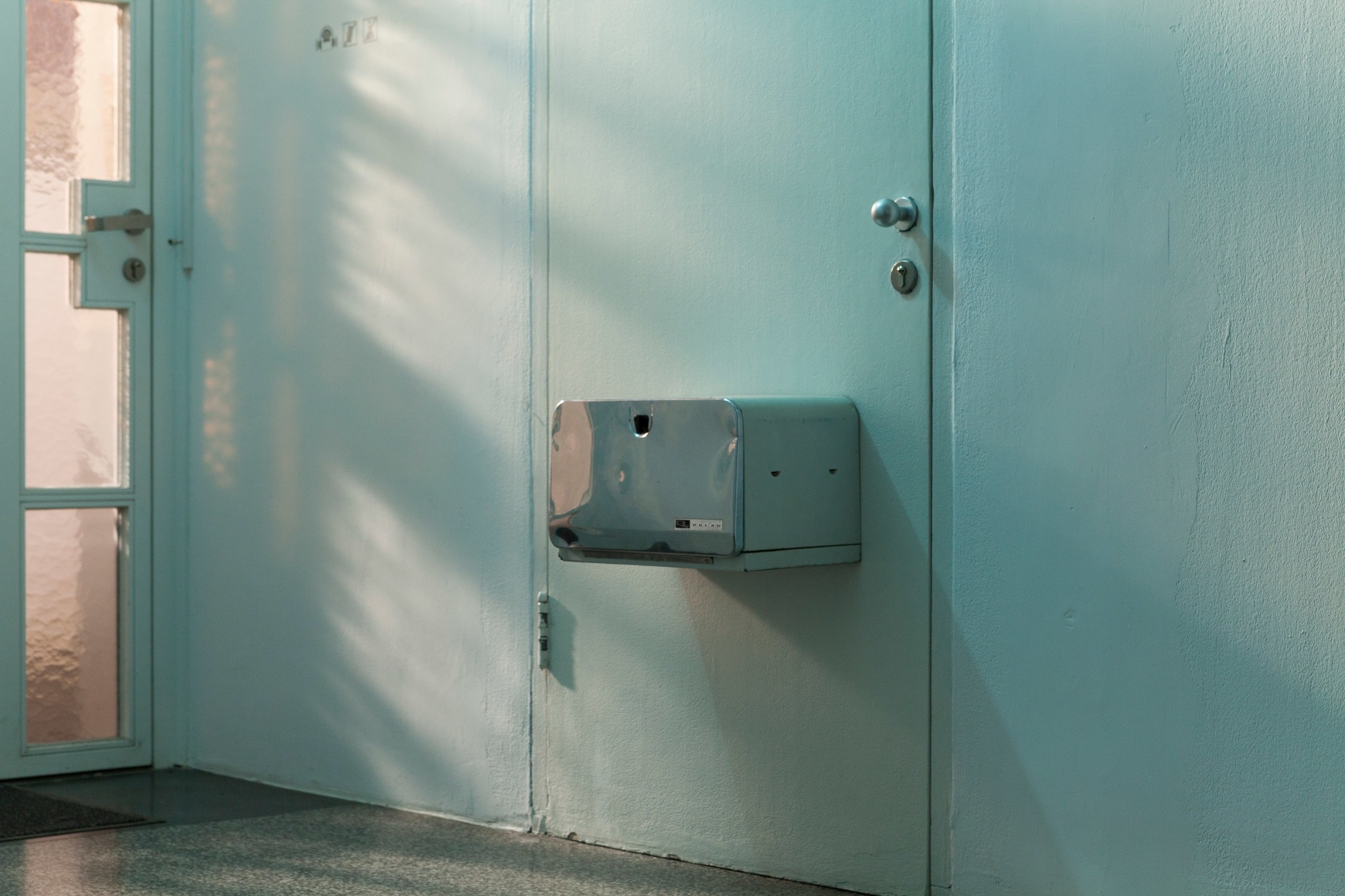
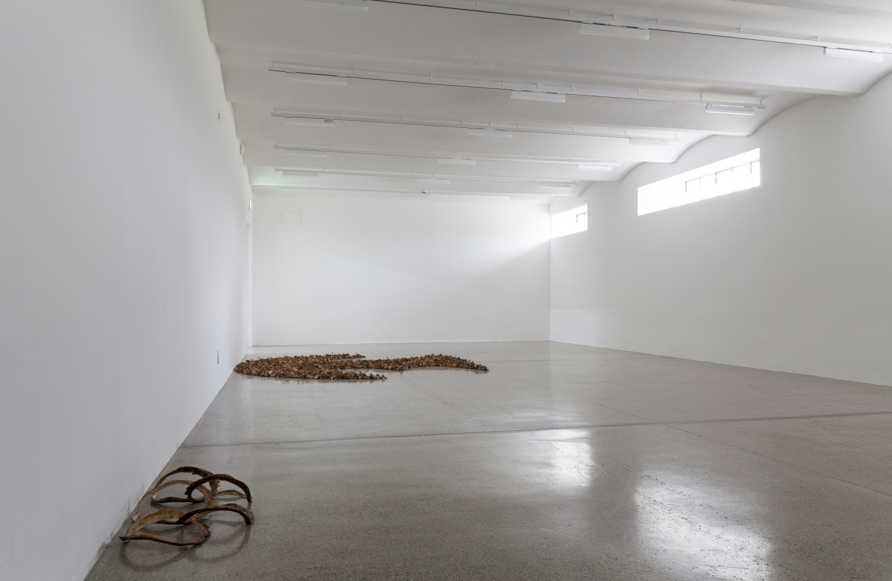
P.S.: It’s February 19, 2020, one day before the opening. The artist is around during the day for discussions and updates; at night, he steps into a deeply concentrated workflow and checks out a variety of options – a steady process of adding and deleting, bringing him closer to the point of his desired outcome. When the work is done, he clears away the remains of his nocturnal experiments before the employees arrive in the morning. Only few, but thoughtfully placed objects are found in the exhibition spaces. The larger part of the exhibition is situated in a succession of rooms in the basement, the so-called Galerie. At the artist’s request, all structures covering windows or doors have been removed, the ceiling lights remain switched off; only more or less faint rays of natural light fall through the few, sparse window panes into the exhibition space, as well as stray light from the general public premises. An emergency fire door between the first and second room vibrates slightly noticeable thanks to three air movers, which the artist has placed here. They make a hell of a noise and create a cool breeze that circulates throughout the gallery. The whirlwind at the beginning of The Wizard of Oz is likely to have served as a blueprint here. Bread boxes seemingly hovering halfway up doors and radiators, look as if they’d been seized by the wind and are now stuck in position, their movement frozen. Countless pumpkin stems are arranged to form a symbol or logo, strangely familiar but hard to decipher – until one realizes, it’s a Batman symbol cut in half, the cut running exactly along the middle line of the terrazzo floor.
To the left, a door opens up to another room, one that was created in the course of the 2018 renovation. Its function is still open, held in suspense, somehow floating between exhibition space, event location, and functional room. Here, Smith has removed a red velvet curtain that covered two walls (the mounting track hints at what is now missing) and here too the lights are switched off – almost; merely two LED light bars glow in the coolest of possible light temperatures. Adapting the lights, twisting the usual settings mark the very beginning of the install process. The lights in front of the Galerie, where a model of the Secession and wall charts with information on the building’s history are located, have been re-programmed and turned from a warm white tone to cold white to harmonize the artificial and natural light. A leather jacket cut in two hangs between two pilasters, not a single written sign points to Smith’s exhibition, while usually the artist’s name in vinyl lettering would give a hint to the show.
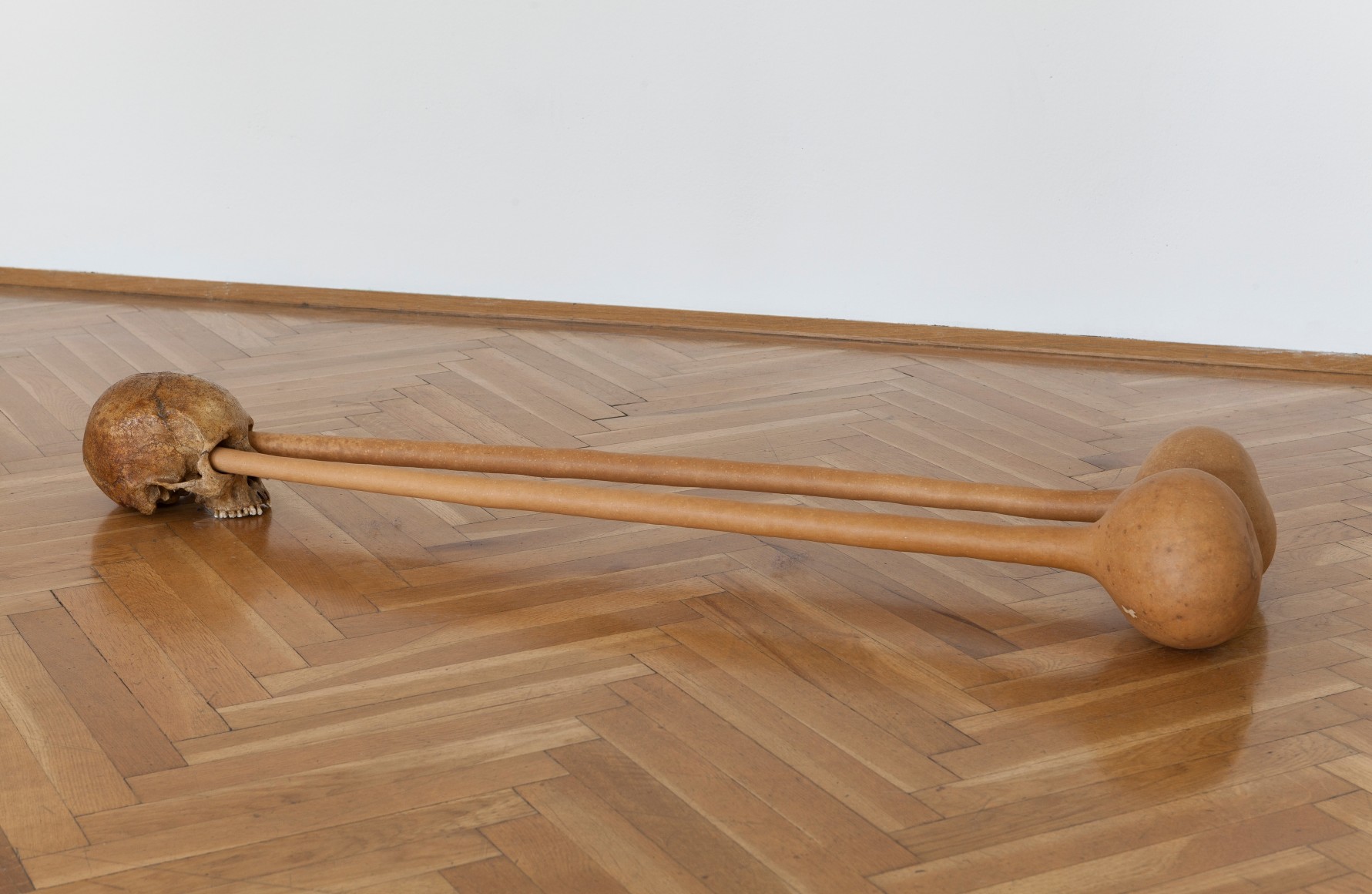
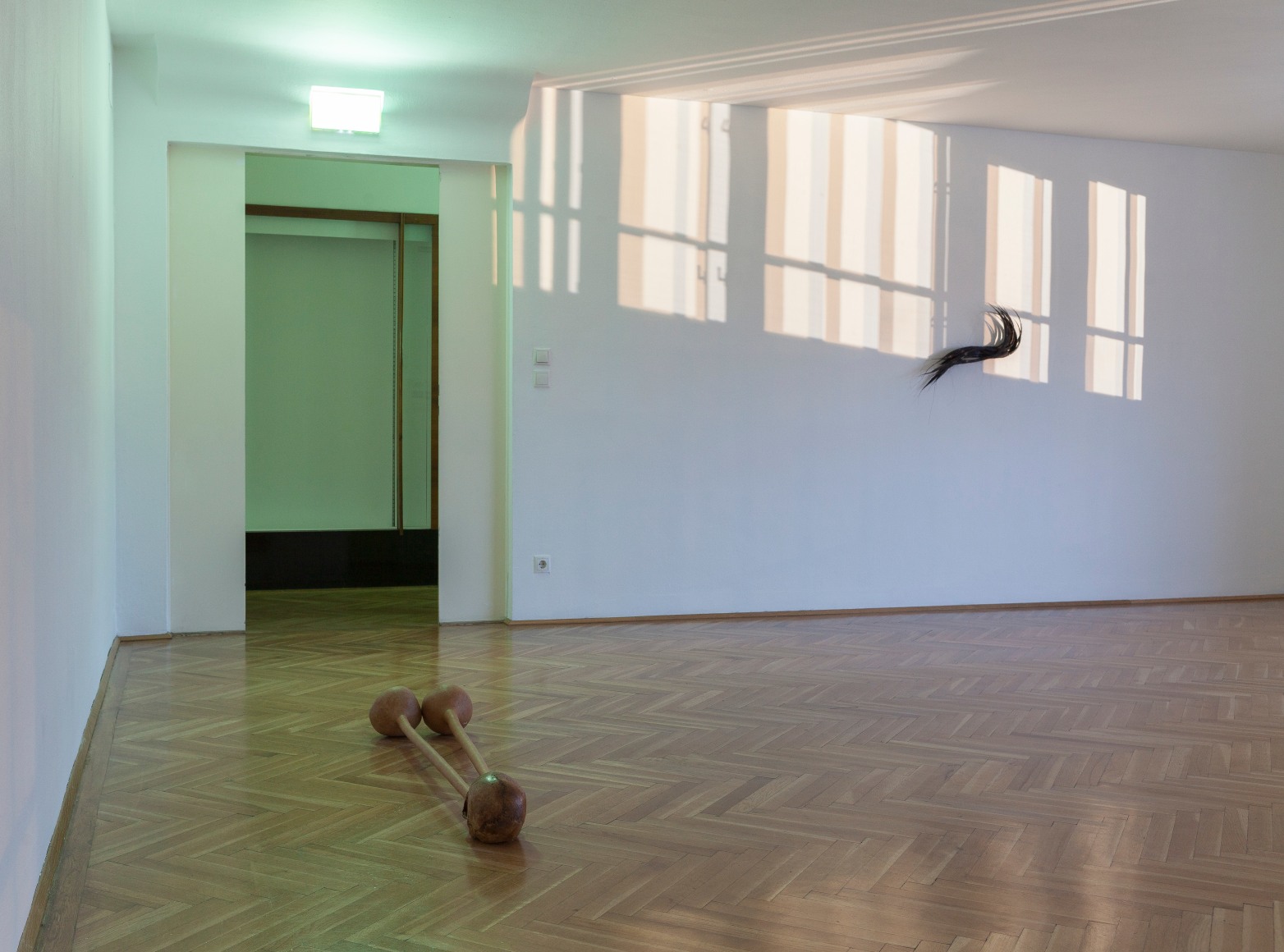
In the Grafisches Kabinett, one comes across a sculpture reminiscent of the visual language of cartoons. Two dried gourds protrude from the eye sockets of a human skull, creating the cited comic-effect, commonly referred to as “eyes popping out of one’s head”. In addition, the vegetables used here attest to collaborations Smith has entered. For one, he hired a farmer to collect, cut off and dry the stems of a year’s whole pumpkin crop. He had the idea for this more or less by chance, when the stem of one of his kids’ (Haloween) pumpkins broke of and he realized that the stem is a symbol for the absence of an object. Also the exceptionally long-necked gourds were specially grown for the artist, hanging on a rack to let the necks grow long and slim. With collaborations like these, Michael E. Smith connects worlds that usually have little in common in a peaceable way.
A final remark: What has been described above is merely speculation. Possibly tomorrow, for the opening, things will be different.

